Our 2024 ADA website compliance checklist can help you better provide an accessible digital experience for all of your site visitors.
Parallel Interactive knows how challenging it is to stay current on the latest website regulations, and recent Americans Disabilities Act (ADA) lawsuits have made digital accessibility a high priority. Nearly 1 in 5 Americans have a disability, meaning there’s an on-going chance of someone filing a case against your business if your site isn’t ADA accessible. A recent article from Forbes reports, “Lawsuits against website owners alleged to have breached the Americans with Disabilities Act have increased rapidly during the first half of 2023 across virtually every metric conceivable.”
The rising number of lawsuits make implementing an ADA website compliance checklist critical for your business in 2024. Many common website design elements, such as sliders, navigation bars, and contact forms, can be barriers to a successful digital experience. As the ADA continues to move into the digital space, Parallel Interactive has created our own ADA website compliance checklist complete with tips and tricks to help you make your website more accessible for visitors.
Visual Content
Poorly defined visual content is one of the top challenges for disabled individuals. Make sure you simplify all visual elements on your website, so your content is easy to read, regardless of whether your customers have visual or cognitive impairments. In a recent study of the online experience for those with disabilities, 55 percent reported poor color contrast and text layout, while 53 percent complained of distracting graphics.
Flashing lights and other images often trigger photosensitive epilepsy and other physical reactions. Without proper trigger warnings in place, you can potentially harm your audience and create an opening for a lawsuit against your company. If you have any potential seizure inducing images or videos that flash more than 3 times per second, provide a clear warning before your audience comes into contact with that imagery.
Alternative Text
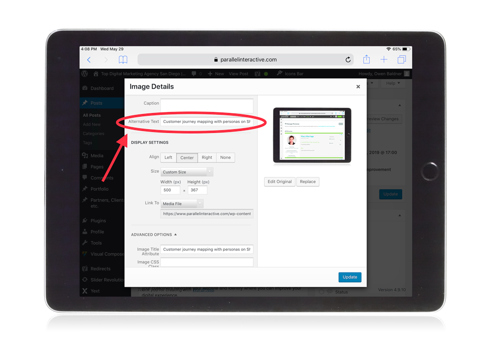
Alternative (Alt) text is a simple way to make sure your site remains ADA compliant. Adding alt text to non-text page elements, such as images, allows audio page readers to easily identify these elements. It is also important for SEO purposes as it gives you another area to optimize your pages with keywords. Parallel Interactive incorporates alt text on all of the images we use across our company and client sites, including long-tail keywords and other identifying features where necessary.
 Turning Off Audio
When using embedded video players, enable the option to turn the audio off from the player so your customers don’t have to mute their machines. This is important for two reasons: page readers use their own audio to communicate with visually impaired customers and other customers may need the audio off in order to concentrate on your text. If a video interferes with someone’s ability to understand the text on the page, that is enough means to launch an official ADA complaint. In your video player settings, confirm you are able to click on an audio toggle button before you publish videos on your website.
Page Identification Text
Include text headings and descriptions across your content to communicate the topic to audio page readers. This makes topics easily identifiable for the visually impaired searching for specific content on your website. Headers also help breakdown content for search engines and increase readability for your readers, making them a best practice no matter how you are trying to optimize your pages. We recommend including headers whenever there is a major topic change in your content and to have at least one detectable H1 header on your pages at all times.
Instructions and Labels on Forms
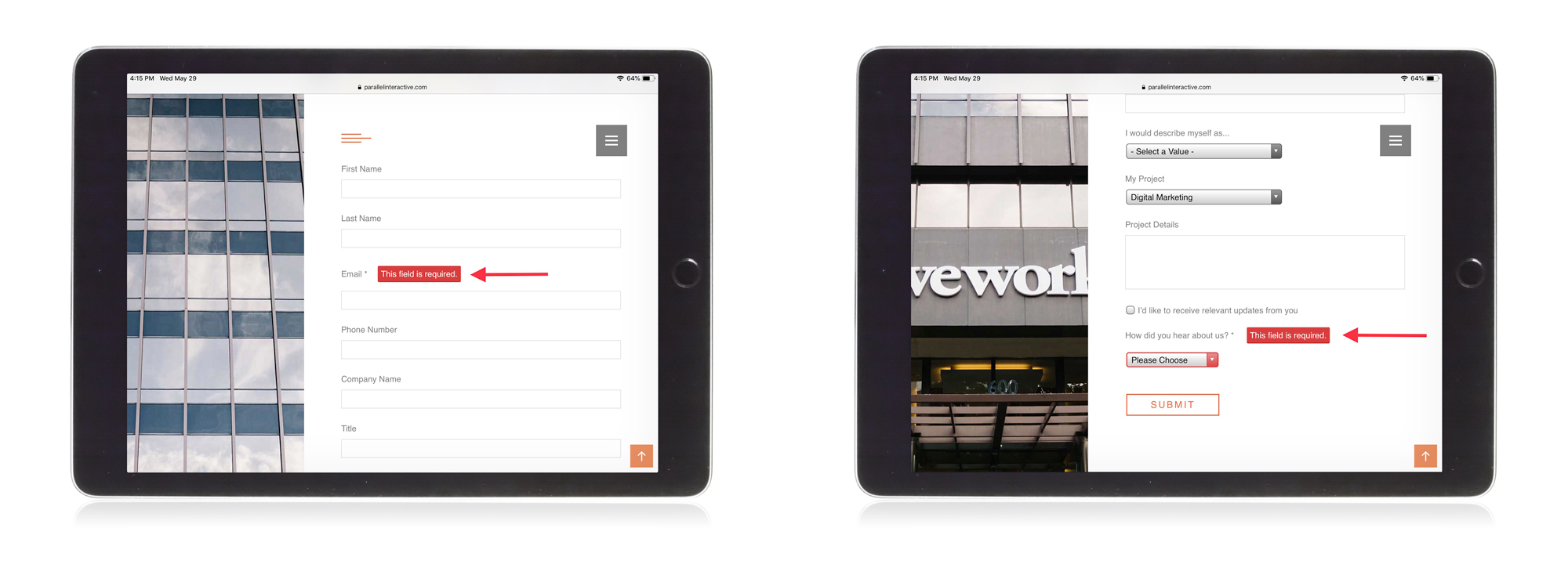
To be truly accessible, every form on your website should have descriptive labels. Make required fields stand out to the viewers so they are aware what is expected from them. If they make an error, provide clear instructions to resolve the issue without causing undo stress. We recommend having an example form ready to show your viewers how a completed form should look.
Keyboard Navigation
A recent analysis of 10 million webpages found that 98 percent of website menus are not fully accessible because there is no way to navigate their sites using only the keyboard. Optimize your site so viewers without a mouse can navigate using the directional arrows, tab, shift, and enter keys on their keyboards. Make sure that you have clear destination points each time a person hits an arrow or tab key for better flow and readability.
Make your website navigation predictable for easy operation among your disabled visitors. Having navigation that is easy to understand with predictable menu locations will make it easier for viewers to navigate using muscle-memory, whereas too many forms and variations in formatting could make navigation disorienting. We recommend keeping your menus simplified with a maximum of 5-7 items with similar page layouts to make your site feel like it has a natural and predictable flow.
UserWay Widget
Ensure ADA compliance by adding the UserWay Accessibility Widget to your website. This widget is available for plain HTML, CSS or Javascript sites as well as leading CMS platforms, such as WordPress. UserWay instantly strengthens weak spots that might cause issues, barriers, and accessibility violations without making changes to your existing code. It will automatically identify potentially non-compliant elements on your site and make smart modifications in real time.
The UserWay Widget offers a wide selection of functions that users can mix and match to meet their specific accessibility needs. Each of the features below can be turned on or off, and settings for each user are automatically saved for future site visits.
We installed the UserWay widget on our site, so it is easier to use and more accessible for those with disabilities. The accessibility menu can be enabled by clicking the icon that floats on each page, and users can also choose to hide the icon at any time.
Tip: We recommend including an Accessibility Statement on your site that expresses your commitment to website accessibility standards and outlines the process you have in place to continuously monitor for WCAG compliance.
Test Your Compliance
We understand no one is perfect and there are going to be compliance areas you may miss. To make sure your site is as compliant as possible, we recommend running your site through an ADA compliance scanner to point out the remaining areas you may have missed. Web Accessibility provides five site tests with the option to sign up for free to access unlimited tests. Each test provides a breakdown of your site’s improvement areas with specific links to the exact problems that occur.
** Parallel Interactive’s ADA Compliance Checklist contains tips and recommendations based on our experience as a digital agency. We make no claims that this is an all-encompassing checklist to meet ADA website compliance guidelines. All clients and companies with a website property need to consult with their legal counsel to ensure they meet all current ADA requirements specific to their website.


