Google’s new Gif Maker creates data visualizations that make your research look better.
According to the company’s announcement, “Data visualizations are an essential storytelling tool in journalism, and though they are often intricate, they don’t have to be complex.” Mashable author Freia Lobo explains how the new Data Gif Maker presents facts and figures in a more eye-catching way.
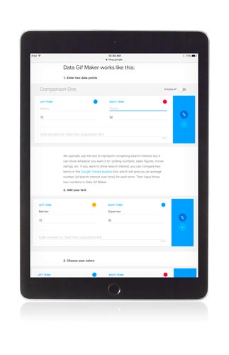
The tool is extremely user-friendly: just add two terms along with their titles, values, and a short description. The engine will quickly generate an animated gif of the data. It’s still at a basic stage and can only compare two data sets, so it’s not the best fit for complex comparisons. However, the added color and motion make it a lot more pleasant to look at than just plain numbers and text.


